So many of us teachers hate graphing and analysing our data! It's one more job, NOT in that 'Urgent and Important' box, done just to please the powers that be, and Excel? Kamar?
Forget the end of year admin pressure to produce your data. The whole point of data is to:
Find trends
Pinpoint areas of success, and
Identify areas that need work.
I always knew this, but hadn't really, put that into practice as part of my teaching - like, during the year rather than just at the end! Data just seemed too 'academic' or 'removed' from the daily heat of the classroom. But then, through colleagues, I found an easy way to do it that involved my colouring pencils, and building towers with students' names!
Creating a graph of your class data ... the BEST way!
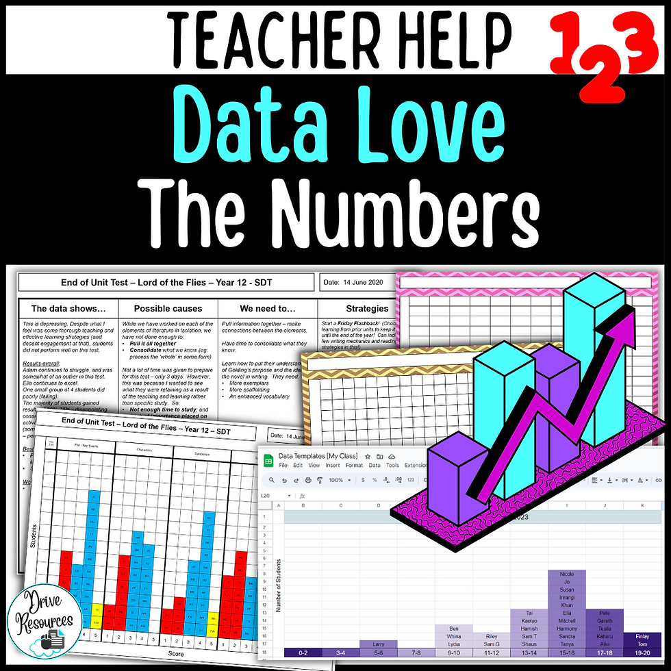
The picture below shows how I used a template to stack students' names in the columns representing their grade (or mark range). Colouring the used cells (pretty cruisy) turns your page into a graph. Voila. It's like magic.
This method is so easy, so basic, you feel it must be wrong in some way, too simple to be effective. But in fact, this is a far more effective way of graphing your class data. Why? It shows where each student lies. It's personalised. It's actually useful for me! Note, the bottom graph shows results from a test out of 25. There's less room on this template, so I've used student's initials.
Summative Assessment Data
With summative data, you get an overall picture of how things went. But, for me, it's far less useful than formative data. This is because, once a final assessment is done ... it's done. The other thing is that it focuses more on that one final mark or grade rather than students' strong or weak points within that assessment.
Still, summative data is good to get an overall picture - especially if you're comparing assessments over the years, and especially if you've tried something new this year. The sticking point with analysing summative assessments from year to year is, of course, that the group you're collecting the data from changes. You're measuring last year's apples with this year's pears. Mmmm...that's something to discuss in your faculty!

Formative Assessment Data
Formative data is the best, and I think any senior admin worth its salt should instead focus on this more than summative analyses.
If I'm teaching, let's say that necessary evil, essay writing, then I want to keep myself informed about the areas students are struggling with, our areas of strength etc. But how do I compile that information when I'm in the throws of marking as we practice over the course of the year?
Easy! I simply adjust my template to fit my rubric then fill it in with students' intials as I mark. In fact, I don't even need a mark book as this becomes my mark book. Here, the essay features I was looking for appear along the top, and each student has been awarded a mark out of 5 for each of those features, with their initials appearing in the appropriate box.
The graphs shown earlier were completed by hand; this has been done electronically - whatever floats your boat.
I've colour-coded so that red = 'danger-danger' and yellow = bright sparks. I can see there is a lot of red in the area of Evidence, so I need to work on this with my students. Better yet though, I can see which students in particular need the most help in this area. In fact, I have used graphs like these to set up tutorials, getting the students that need help and/or extension to join me as part of a small group. Can I show the class these graphs? Absolutely - but I take out the initials beforehand, just leaving the coloured bars. These are a great eye-opener and fodder for class discussions around how 'we' are all doing.
Analysing Your Data - telling a story
While I can easily see exactly who needs what here, it does make a difference if I write it up. Below is an easy template that I admit I don't always complete - I can do it in my head now. However, far out does it make a difference when I focus those thoughts on the four aspects you see below!
Need a hand? Grab freebie examples to keep handy!
Bottom line - love doin' ya data by making it work for you. Go! Frolic in your data. You too can feel data love - I promise! If you want printable, editable and Google Sheets templates, check out the resource below!
👇🫶👇🫶👇🫶👇
Enjoy tips and ideas, and keep up to date with Drive Resources:
✿ Join my team here – access our freebies library and love the emailed tips and updates!
✿ Like my Facebook page.
✿ Follow me on Instagram.
✿ Follow me on TPT.
✿ Subscribe to my YouTube channel.

.png)


Comments